
Street Typer is a two-player typing game where players combine word attacks and word defenses to defeat their opponent.
- Timeline
- 3 months, Spring 2023
- Areas
- Creative Direction, UI/UX & Prototyping, Game Development, Visual Identity, Animation
- Team
- Peggy Shen, Grace Li, Ruifen Jin, Ziyu Li
- Tools
- Unity, GitHub, Figma, Procreate, Clip Studio Art, iMovie, Discord
- CREATIVE
- STRATEGY
- UI
Project Overview
Street Typer was originally crafted in Carnegie Mellon's Experimental Game Studio, where small interdisciplinary teams pitched, built, playtested, and shipped original games over a semester. Joining after the first prototype had already been developed, I stepped into a lead role to help evolve the game into a more polished and exciting multiplayer experience.
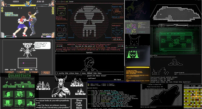
Inspired by classic arcade fighters and ASCII terminal graphics, Street Typer is a party game for friends that transforms typing into a competitive battle of devastating yet creative attacks.
My Contributions
I served as Product Lead and led the game’s creative direction, aligning mechanics, interface design, visual identity, animation, and launch strategy around a cohesive player experience.
I helped define the product vision and gameplay goals, directed the evolution of the interface and art style, and coordinated work across design, engineering, and illustration. I also refined UI concepts, character animation, and launch assets for publishing and showcase.
I. Core Flows

Host a Match with Friends
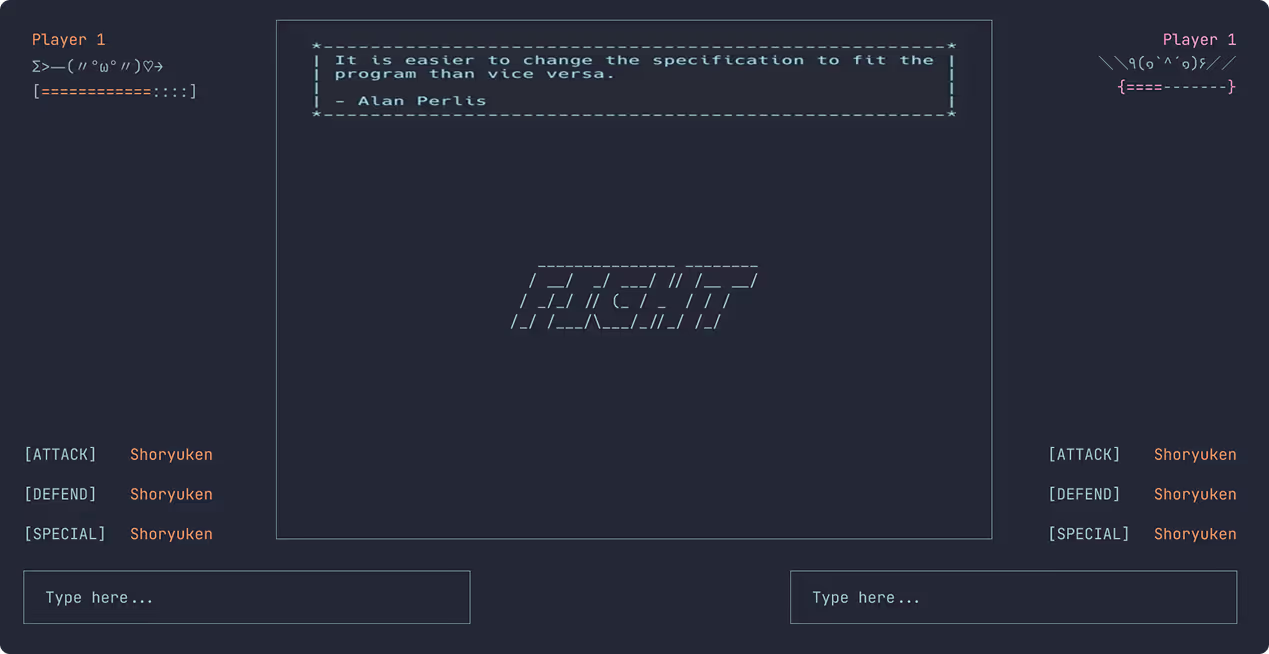
Players can host a game by pressing Host (P1) in order to play with a friend, who joins their game by typing in the host IP address and pressing Client (P2). They can now battle against each other in the same typing match.

Create Combos from the Word Bank
Players type in a combination of adjectives and verbs (blue-colored attack "attributes" + white-colored word "attacks") from a shared word bank. The longer the attack, the more damage to the opponent, and the more difficult for the opponent to defend against.

Type Blocks to Defend from Attacks
After receiving an attack, players have a brief window to type in a block command and successfully defend against your onslaught, avoiding any harm. The block command varies in typing difficulty based on the attack received. If the player is not successful in blocking, they will take some damage to their health. Once the opponent's blue health bar reaches 0, the player wins the battle.
II. Challenge
Addressing visual design and gameplay challenges to create an engaging and educational multiplayer experience.
I joined the Street Typer team after the game had its first iteration, during which a working prototype was created. From there, we had more iterating to do in order to clarify our scope and player experience, and elevate the prototype to a playable game.
I will go over two of our main hurdles and how we approached them.
How do we transform typing practice into an engaging experience that people choose to play with friends?
- 1
Refining the Game Mechanics
There were flaws in the original gameplay, so we needed to restructure how players strategically interacted with the keyboard and each other.
- 2
Designing the User Experience
We lacked a consistent creative direction, so we focused on building a backstory for our battleground: an ASCII, arcade-like world.
Original Concept Board




III. Context + Research
Introducing the problems and progress of the original game concept, alongside various media and video game inspirations.
Refining the Game Mechanics
The original video game concept was a "hacking game" imagined in the computer terminal setting, a two-player typing competition that was based solely on typing speed. Players could type anything they wanted to in their respective input boxes.
The biggest problem with this game experience was that players could exploit each typing match against their opponent by mashing keyboard buttons to win. We noticed this was happening a lot during our preliminary player tests.
Traits of popular online typing games
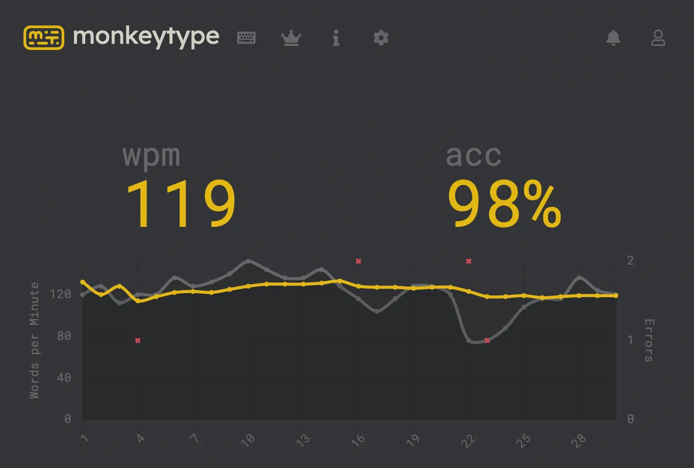
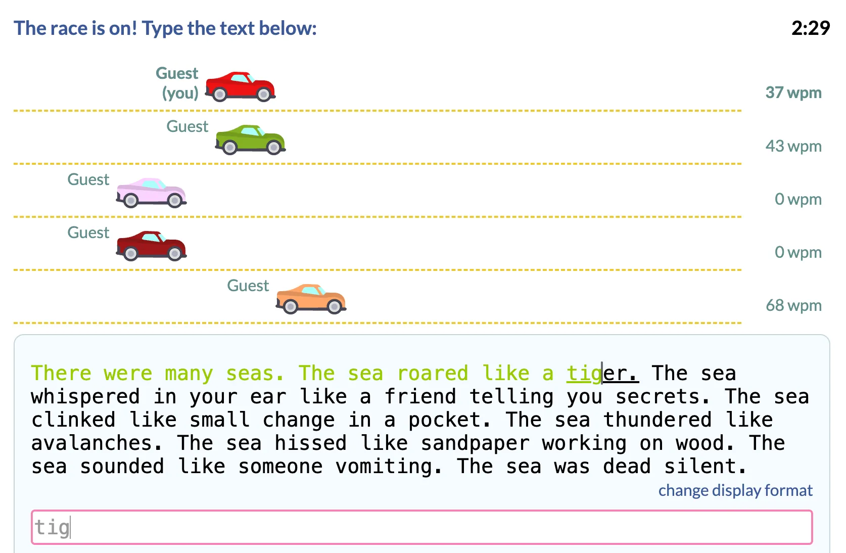
Most games:
- 1.Based on which player or players type a passage correctly the fastest
- 2.Condenses typing skill into various easily comparable numerical scores
- 3.Biggest numerical focus is on the words-per-minute (WPM) statistic
- 4.Easy to repeat playability
Existing typing games excel at measuring performance, but they don’t often create memorable social experiences.
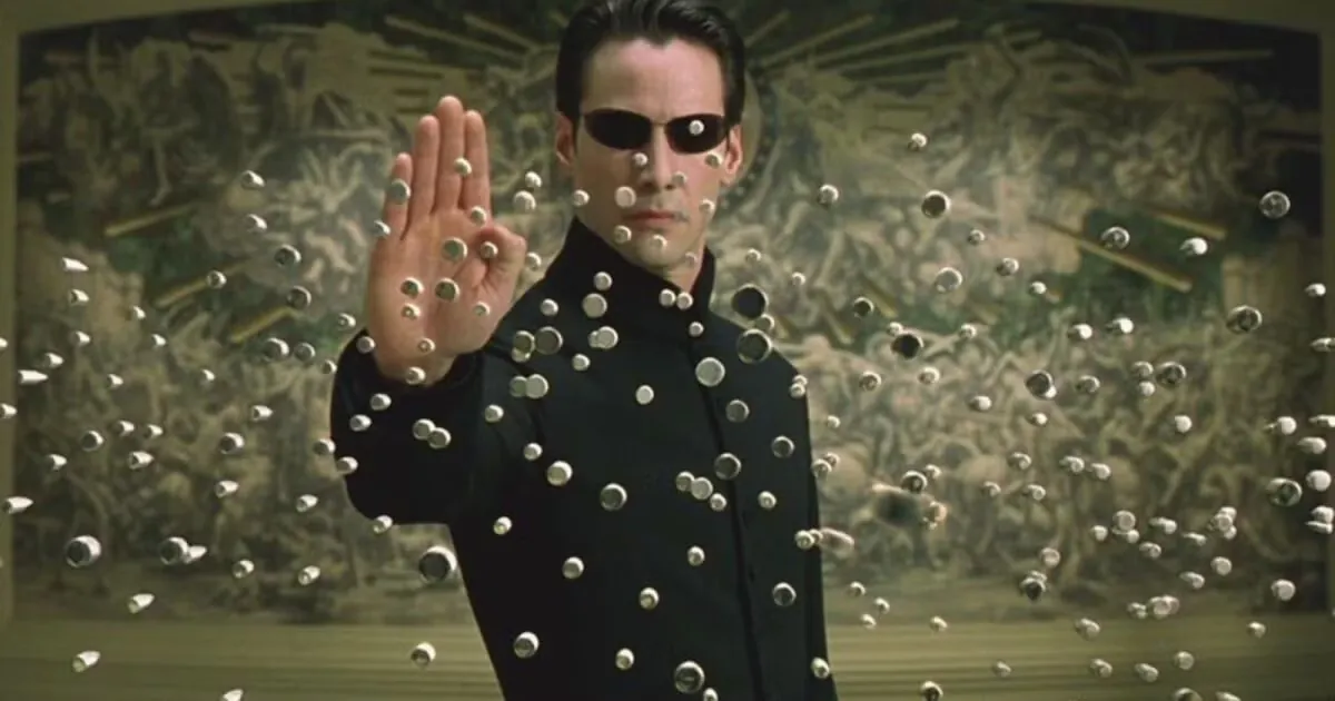
We wanted to create an experience that was more strategic and exciting, but also different from current typing games whose win condition relied completely on typing speed. Therefore, we wanted to polish a multiplayer game that friends would genuinely choose to play together, where improving typing became a natural byproduct of having fun.
Design Opportunity
How can we make typing feel like play instead of practice?
This highlighted an opportunity: rather than optimizing for words per minute alone like in our first iteration, we wanted a game that rewarded creativity, strategy, and social play.
We weren't designing for professional typists but rather players who enjoy local multiplayer games where skill, laughter, and friendly competition matter more than performance, making typing improvement a consequence of having fun instead of the primary goal.
IV. Gameplay Design
Deciding our main game mechanic, a shared word bank that fosters competitive playfulness and creativity among the two players.
DESIGN DECISION #1
Reward creativity instead of typing speed
Optimizing for words per minute alone rewarded players who could mash keys the fastest, which worked against thoughtful playtime.
We explored several ways to design the core typing loop. For example, most typing games used fixed passages which kept the competition fair, but lacked any expressivity. A shared word bank was the option that held both: a constrained set of words that leaves the combination up to the player.
| Mechanic | Pros | Cons |
|---|---|---|
| Free typing | Unlimited creativity | Easy to exploit through key mashing |
| Fixed passages | Fair competition | Feels repetitive and limits expression |
| Shared word bank | Strategic, creative, balanced | Requires players to think under pressure |
Free typing
- Pros
- Unlimited creativity
- Cons
- Easy to exploit through key mashing
Fixed passages
- Pros
- Fair competition
- Cons
- Feels repetitive and limits expression
Shared word bank
- Pros
- Strategic, creative, balanced
- Cons
- Requires players to think under pressure
The shared word bank became the centerpiece of the interface where players must select specific words to type. This allowed for deliberate competition against the opponent when coming up with different word combinations.
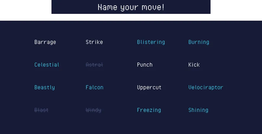
Using the word bank, players deal damage to each other by "creating" attacks through wordplay – typing in descriptor adjectives before an attack verb.
In this case, Player 1 throws a “burning punch” at Player 2, who casts a defensive “silver blast barrier” in order to lessen the blow.
Select a numbered panel to see how attacking and blocking work.
For example, typing the words "BURNING PUNCH" would deal some damage to the opponent, but typing in "BURNING BLISTERING PUNCH" would deal even more damage due to the extra adjective.
On the other end, in order to block an attack, the opponent would need to accurately type a random phrase that shows up on their screen, with phrases varying in difficulty based on the strength of the attack.
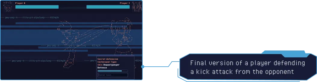
Longer combinations dealt more damage, but also required more time to type, introducing a meaningful risk–reward tradeoff during combat.
The interface also needed to support rapid decision-making under pressure. We iterated on it to help players quickly compose attacks without overwhelming the screen. Revisions ultimately simplified the visual hierarchy, leading to a cleaner layout that kept focus on the mechanics.
Interface Iterations
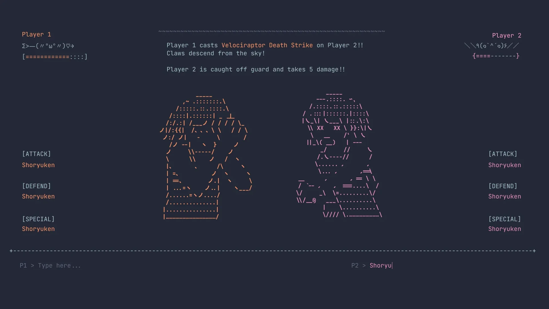
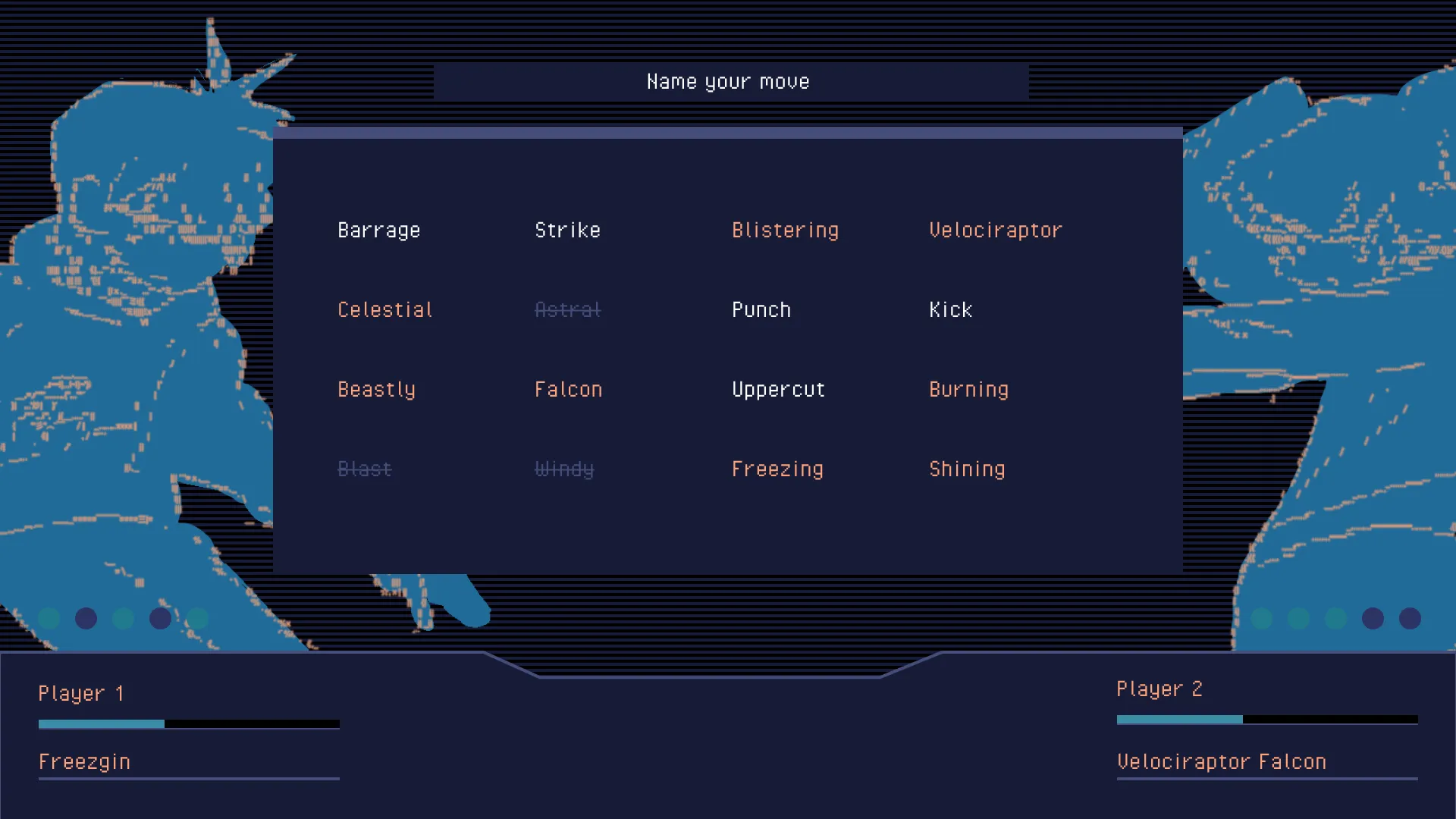
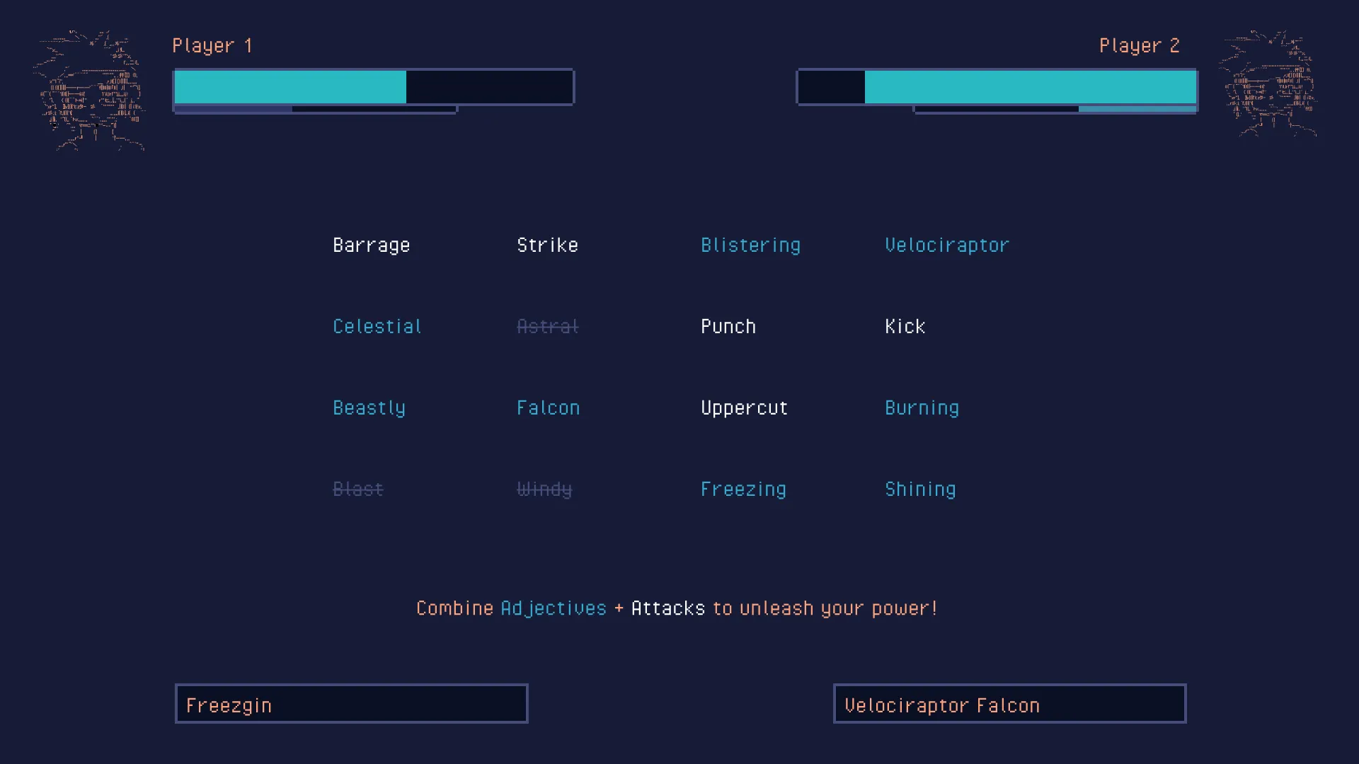
This new core mechanic ultimately transformed typing from a race of speed into a balanced game of strategy, creativity, and expressive play.
V. Visual Direction
Learning from visual styles of past gaming eras to hone in on our game's creative expression and art direction.
Defining the Visual Experience
In our first round of play tests, we noticed a lack of world-building and art direction. The original prototype was mechanically functional, but visually it still felt like a typing application rather than a competitive battle. We needed a stronger visual identity that reinforced the engaging personality of "fighting".
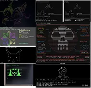
Old Visual Direction
Our old visual concept leaned into hacker culture and terminal interface visuals popularized by film and media. While this reinforced the typing theme, it lacked the energy, character, and spectacle that make battles feel exciting.
Our old visual concept leaned into hacker culture and terminal interface visuals popularized by film and media. While this reinforced the typing theme, it lacked the energy, character, and spectacle that make battles feel exciting.
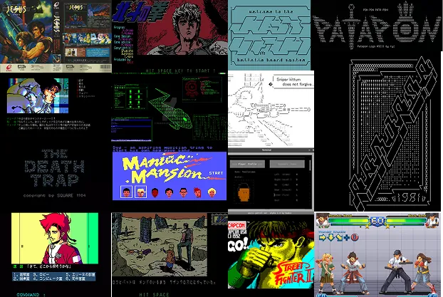
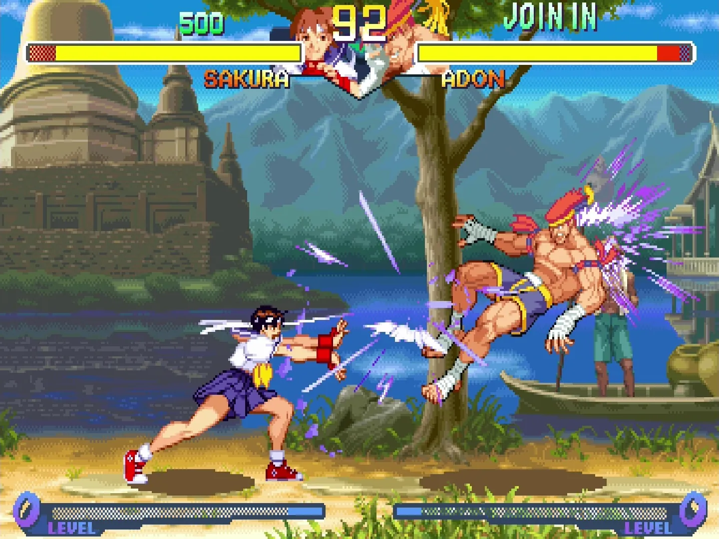
We shifted toward the retro fighting games from the 80s and 90s arcade era.
Starting from our original nod to the Street Fighter series, we expanded our view to many other iconic fighting games and extracted favorite stylistic parts to form a new game style: more focus on bold colors, expressive characters, and exaggerated combat.
Design Principles
- Keep the creative makeshift charm of ASCII art
- Celebrate the spectacle of fighting-style arcade games
- Create a nostalgic yet playful visual identity
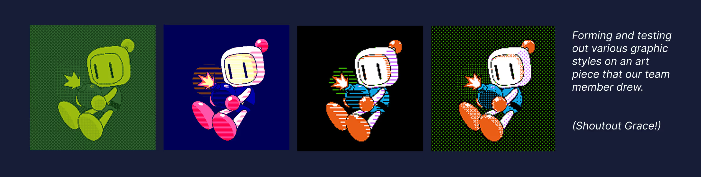
Rather than simply imitating retro games, we studied the visual constraints that shaped the distinctive style of arcade, battle, and console games. While before their style emerged out of technological limitations, we purposefully experimented with pixel art, bitmap rendering, 8-bit visuals, and dithering techniques to recreate the feeling of classic games using modern tools.
VI. Motion + Animation
Building out the character development of the two players through lore as well as unique motion and animation styles.
While the new visual direction established the world, the characters themselves still lacked personality. We wanted every typed attack to have a tangible and visual impact on the battle.
Character Studies
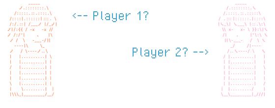
Specifically, we looked to build out our two battle characters and their lore, the players of the game. Our earliest characters were visually indistinguishable with no personality or narrative.
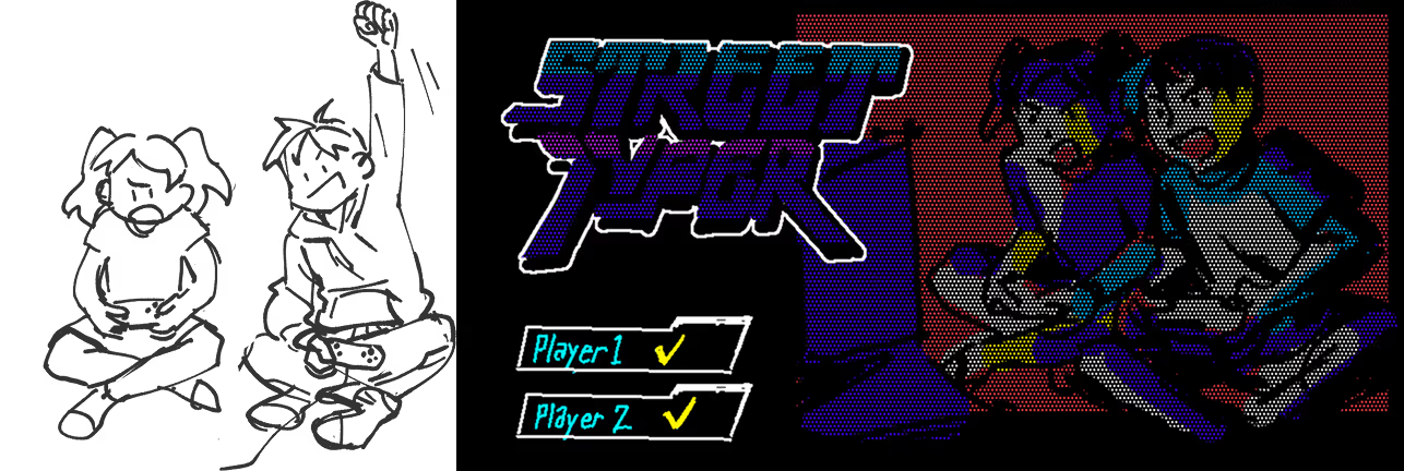
To flesh out the characters, we looked towards our own childhood memories playing games, exploring the idea of them being childhood friends who played fighting games together. We reimagined the two combatants as childhood friends locked in an endless friendly rivalry.
Motion Design
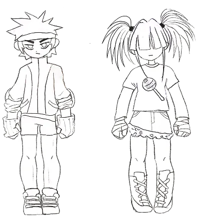
To communicate that rivalry, we researched (and played!) old fighting games to study their character sheets, taking inspiration from a variety of different movement sets.
We thus created different animations for both characters’ attacks, including punches and kicks. We also animated defensive blocks, an ultimate push, and death sequences.
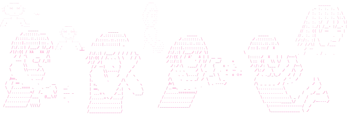
In the end, we still wanted a way to visualize our characters with ASCII-style art, and continued to go through various unsuccessful iterations to convey the characters better.
Like in the image, these iterations were oftentimes too uncommunicative to make sense of what the ASCII conveyed, or too simple and clunky in a way that made animating character attack sequences difficult.
Breakthrough
A breakthrough occurred when we discovered an image-to-ASCII converter (DeepAA by OsciiArt) that worked perfectly for our needs. We were able to convey our character illustrations as ASCII-style animations after modifications in speed and linework.
Putting the animations in our game helped achieve our goal of giving the player a visual sense that their typed text translated to attack and block interactions with each other. Every successful attack or defense now produced immediate visual feedback.


VII. Brand Identity
Launch assets that extended Street Typer's identity beyond the game itself.
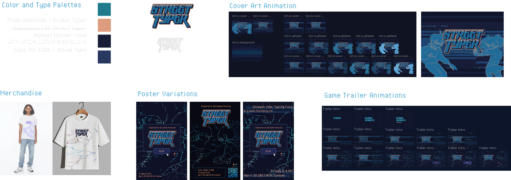
As the project approached launch, I translated Street Typer's creative direction into a cohesive brand identity spanning our Itch.io page and online presence.
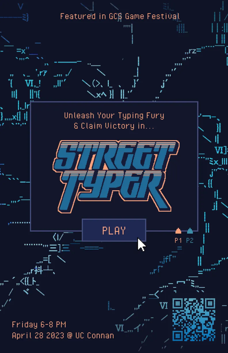
I developed the promotional game trailer, key art and cover art, posters, merchandise, and showcase materials. Maintaining visual consistency across the game and its promotional assets helped reinforce the game's identity from first glance.
VIII. Outcomes
Street Typer launched and was showcased to players both online and in-person.
My launch work propelled the game to be accessible to interested players online and ultimately was:
- Published on itch.io as a downloadable game
- Featured on the front page of Read.cv (later acquired by Anthropic)
- Supported through voluntary player donations across 150+ game downloads, organically without any marketing
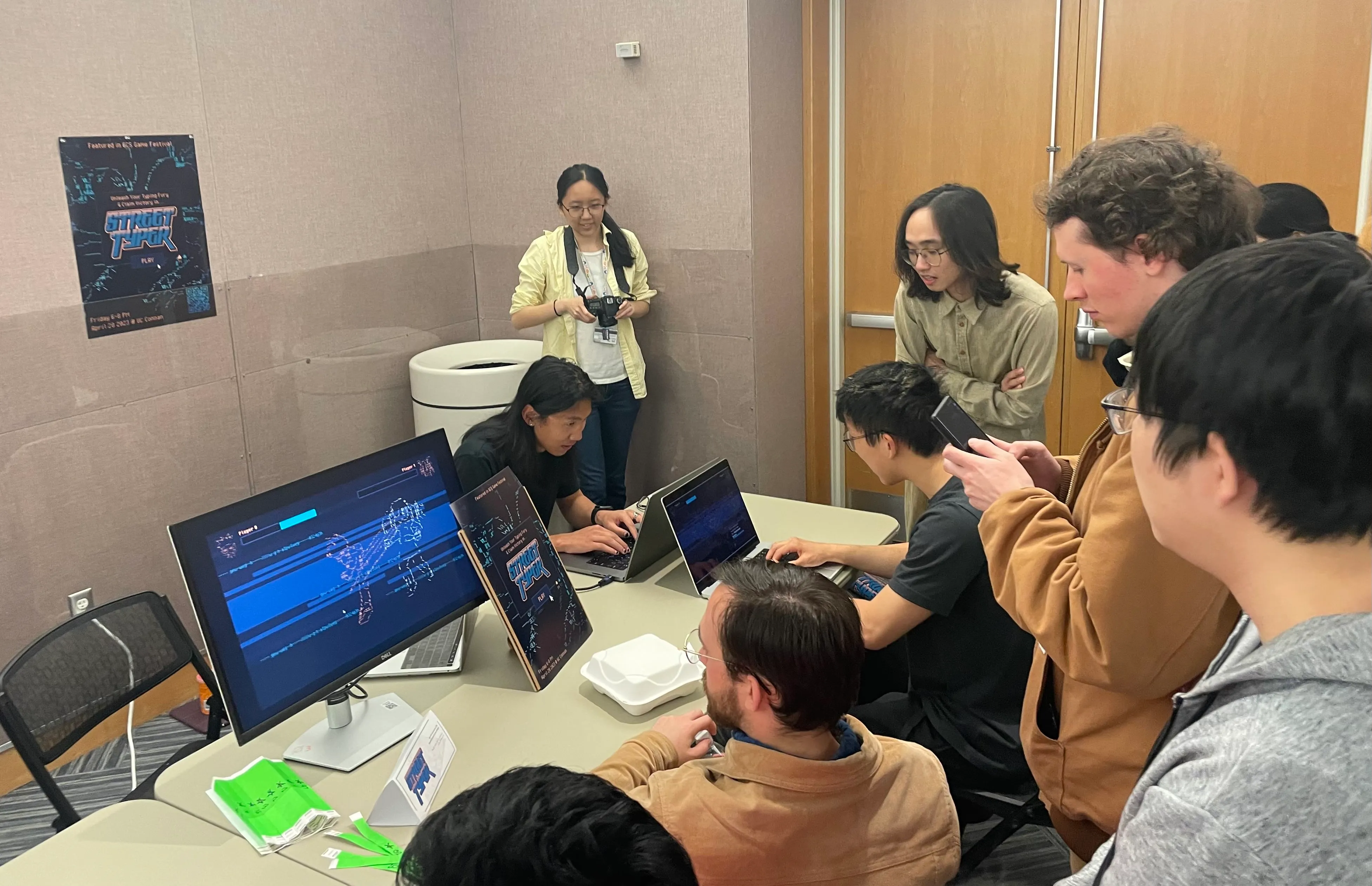
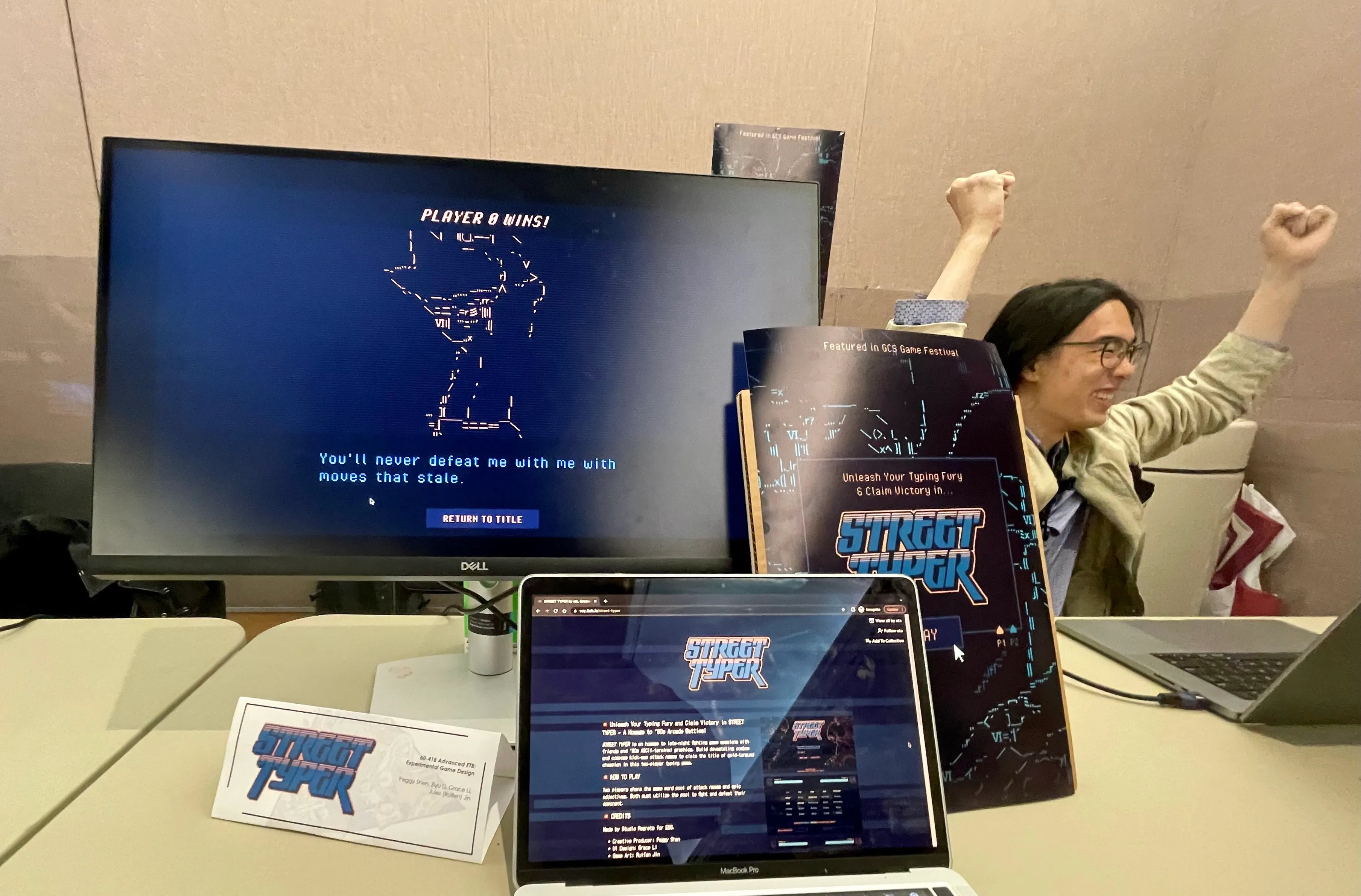
- Presented at Carnegie Mellon's yearly Game Creation Society Showcase, where 50+ students played the game live
But the most rewarding part was seeing people play our game in person and watching them laugh while inventing attach names :)
Reflections
🎮 Designing intangible game feel.
Designing for a game taught me to value the little details and how to really polish an experience. Small additions like animation timing, motion, audio, and feedback heavily changed how gameplay felt.
🤹 Collaborating on a passion project.
Leading a multidisciplinary team taught me how to align programmers, artists, and designers around a shared player experience. I found that product leadership was about maintaining a consistent vision while helping each discipline do its best work. I especially enjoyed taking on this role in aligning the game’s direction and future.
🚀 The launch experience is part of the game!
Street Typer also helped me view products more holistically. In particular, I saw my design efforts on the launch experience shape how players viewed the game before playing. It was heartwarming to watch others curiously approach our booth and witness their enjoyment and engagement.