
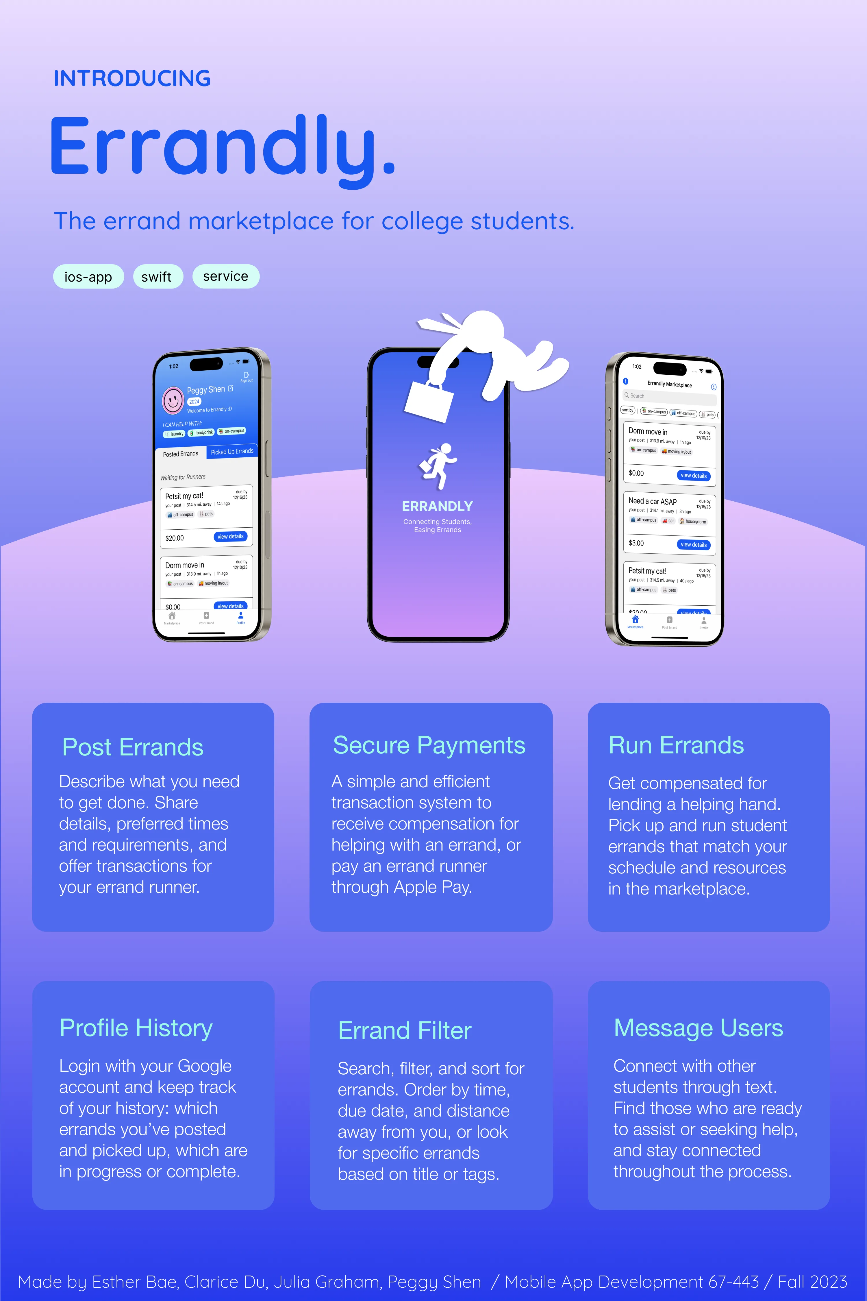
Errandly is a mobile marketplace application for college students to post and fulfill daily errands with their peers.
- Timeline
- 15 weeks (6 sprints), Sep – Dec 2023
- Areas
- UX Design, Visual Design, Market Research, Full-Stack Development, Agile Methodology
- Team
- Peggy Shen, Esther Bae, Clarice Du, Julia Graham
- Tools
- SwiftUI (XCode), GitHub, Firebase, Figma, Procreate, Adobe Premiere Pro, Trello
- UX
- BRAND
- DEVELOPMENT
Project Overview
Errandly was built for a 15-week mobile app development competition sponsored by Capital One, where teams designed and shipped an iOS application from scratch across six agile sprints.
Errandly is a campus marketplace that helps students request and complete everyday errands, from moving and grocery pickups to pet sitting. The central design challenge was creating coordination and trust for students to comfortably request and complete errands with peers reliably.
My Contributions
I led the product's UX/UI design, defining the end-to-end user experience, information architecture, interaction patterns, and visual identity.
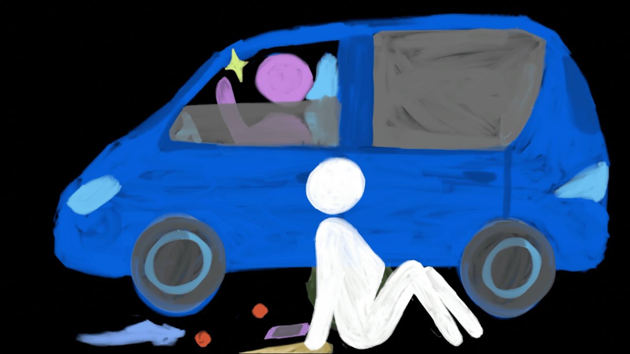
Beyond design, I collaborated on front-end implementation in SwiftUI, refining views and interaction logic. I also created launch and marketing assets including a cel-animated promotional video (see above) and brand campaign (i.e. poster; see end of the case study) to support the final pitch.
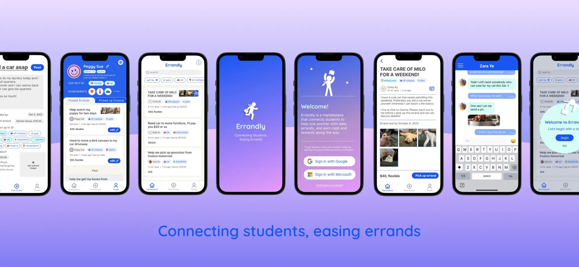
I. Core Flows

Post an Errand

Create a request in seconds by describing the task, choosing a due date, and adding tags or a location to help others discover it.

Run Errands for Students
Get compensated for lending a helping hand. Browse requests, review details, and accept those that fit your schedule. Students coordinate directly and complete the task for payment.
Search, Sort, and Filter

Quickly narrow the marketplace by keyword, tags, due date, distance, or newest posts to find relevant errands faster.
Platform Integrations and Features
Payments with Apple Pay API
An efficient transaction system that enabled secure in-app payments between errand requesters and runners.
Text with iMessage integration
Students can quickly coordinate and connect after accepting an errand.
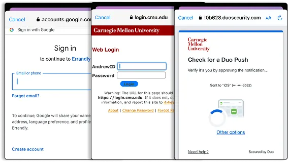
Onboarding with Google OAuth
Custom profiles support persistent user accounts and errand history across posted, accepted, active, and completed requests.
II. Problem + Research
For freshmen and international college students, it can be difficult adjusting to and balancing adulting with college.
As students enter college and adulthood, many are on their own for the first time in their life and face a sudden increase in individual responsibilities. Standard tasks such as moving apartments, picking up food and supplies, or caring for a pet can be difficult without a car or a consistent local presence.
We explored this problem space by conducting guerrilla interviews with 6 students across Pittsburgh campuses. To understand their pain points, we also surveyed 35 undergraduate and graduate college students nationwide about college-specific chores where they needed an extra helping hand.
6 Most Common Errands College Students Identified As Needing Outside Help to Complete
Students are open to the idea of paying for assistance with errands, with 72.7% willing or receptive to doing so.
Upon further interviews with users that answered “Depends” or “Maybe,” we found that affordability and reliability of services are key factors for users, and would be guiding principles when designing our app.
Would you pay for assistance with college-related chores if a convenient, reliable service were available?
33 responses
77.4% of Students are also willing to help their peers, without mentioning incentives like financial compensation.
Upon our follow-up interviews, we noticed that financial incentive helps sway interviewees who answered “Maybe” or “Depends” to be interested in running errands for others.
Would you want to help college students with chores if a convenient, reliable service was available?
31 responses
User Interviews
Our 6 interviews highlighted 3 groups that faced the greatest coordination challenges: freshmen, international students, and students without cars. Specifically, those building a new support system from scratch may struggle more to find resources and help.
"As an international student in a new country who doesn't know anyone well yet, it can be hard to find someone who can help [with errands]."
– Graduate Student, University of Pennsylvania
"I have difficulty with tasks that require a car, and I didn't bring a car to college. Carrying a lot of groceries, moving apartments, or storing my items over the summer are all tasks where I have to ask around and hope friends can help me."
– Undergraduate Student, Carnegie Mellon University
Real World Examples
We explored our own college group channels, chat groups, and social media circles. I found various real world examples of students requesting help with errands, chores, and services across different platforms, validating that this behavior already existed.
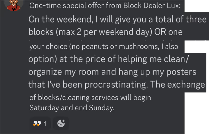
Mandatory college meal plans
Students purchasing meal plans have leftover "blocks" (meals) at semester end, so there are many messages offering student food discounts.
Carnegie Mellon Class of 2027 "block-market" channel · Discord server
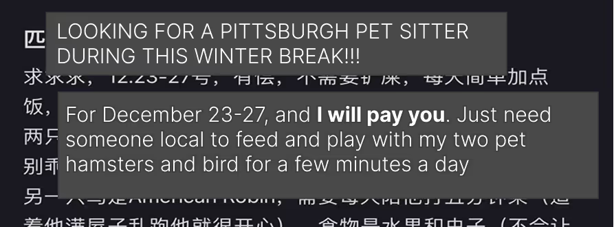
Pet-sitting over school breaks
On RedNote, a student user is urgently looking for someone local to Pittsburgh to take care of their pets over winter break.
Post from RedNote app (小红书) · Chinese social media platform
III. Opportunity Analysis
Existing solutions solved pieces of the problem, but none were designed around campus-specific coordination.
Chore Assistance Apps




Furniture Marketplaces







College Community Apps








I conducted the competitive analysis across service marketplaces and college community platforms to identify gaps in campus-specific coordination. We observed many existing services that focused on completing chores or fostering college communities, but not both.
What this meant was that none were designed for campus-specific needs such as summer storage or finding quarters for dorm laundry machines.
For example, in researching student use of Facebook and Discord, we noticed that while platforms hosted many school-specific groups, conversation would often be unfocused and inconsistent. Facebook skewed toward older students and alumni, while Discord was more popular among underclassmen.
Students relied on these communities like Facebook Groups, Discord, and group chats to ask for help, but requests scattered across disconnected platforms were easy to miss and couldn't reach a large group of potential responders.
Design Opportunity
How can we transform fragmented requests into opportunities for connection?
Research Insight
Students already coordinate everyday requests across scattered channels.
Instagram
Discord
Facebook Groups
WeChat
Slack / Text
Design Opportunity
We want to centralize fragmented student coordination into one campus hub.
A unified feed of requests/offers
Within a trusted community and reputation
Searchable and organized by category
Streamlined communication and updates
Mobile Affordances
We leaned on the strengths and mindset of building mobile for the moments students need help.
Geo-sensitive
Mobile is localized; nearby students are best positioned to help with time-sensitive tasks.
Microtasks
Mobile affords getting everyday tasks done quickly in real-time instead of long-term gigs.
Spontaneous
Mobile portability means enabling errand running on-the-go wherever, whenever.
IV. Design Iterations
Over 6 agile sprints, we refined the experience through 4 rounds of usability testing and 2 development iterations.
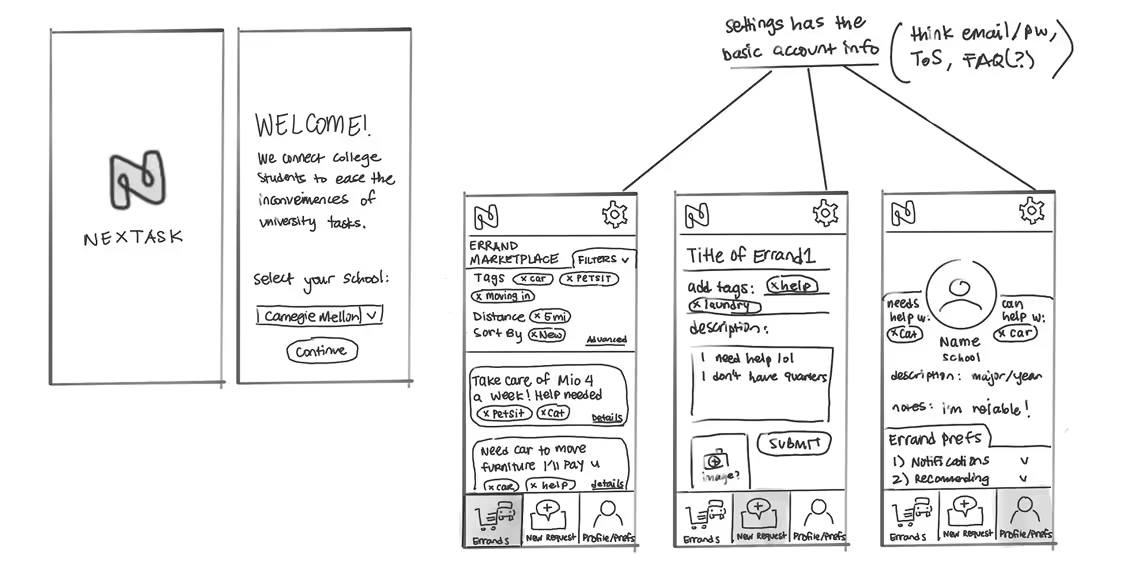
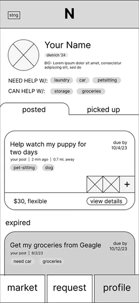
To explore the product's information architecture, we each sketched several early concepts for the marketplace experience. My direction, NexTask, established the three primary navigation areas that carried through to the final product: Marketplace, Post, and Profile.
Low-Fidelity Wireframes
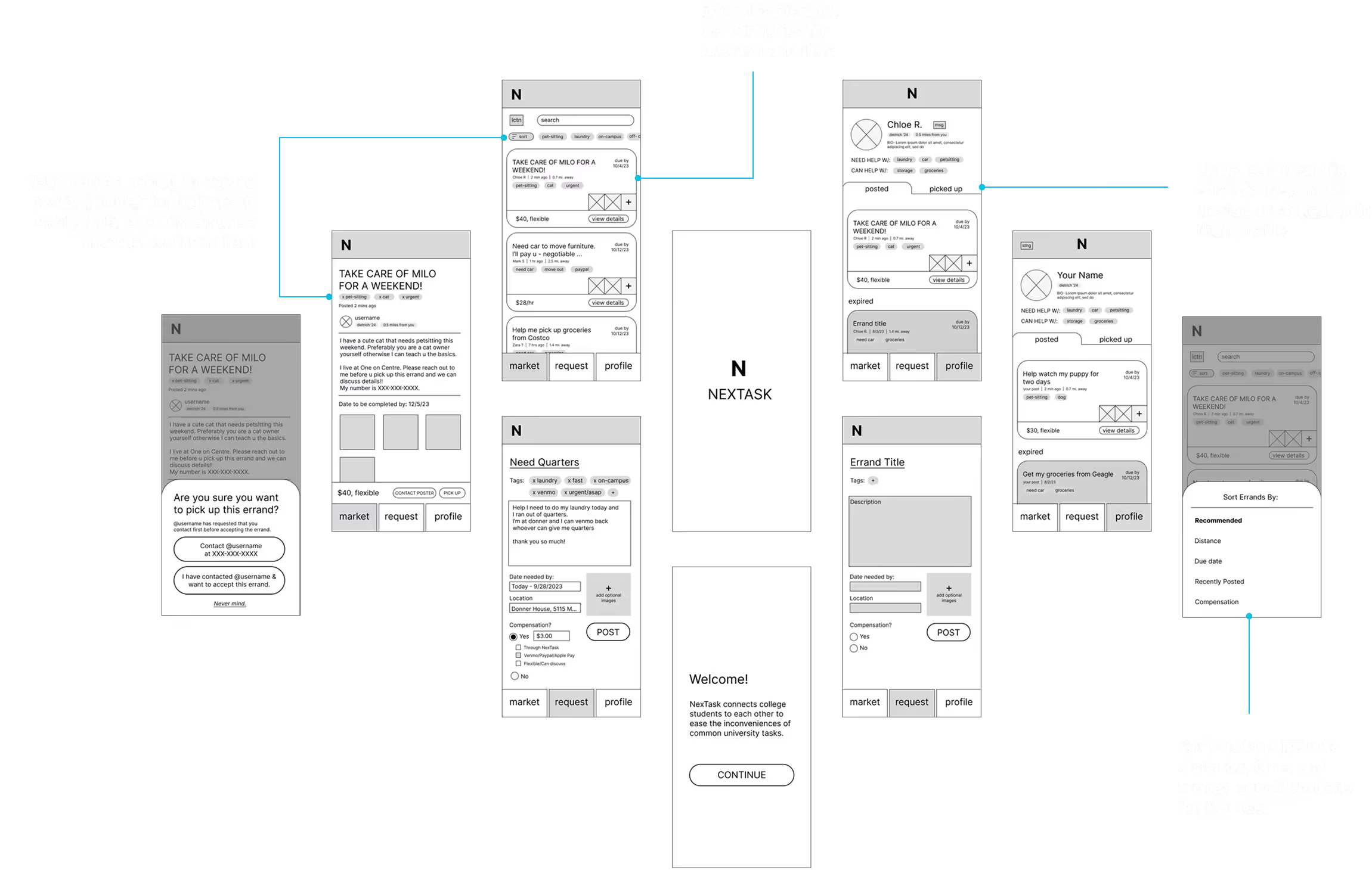
We translated the core flows into low-fidelity wireframes using the Balsamiq Kit on Figma, and asked 5 users to test 3 core scenarios: posting an errand to the marketplace, picking up a peer's errand, and viewing an errand's details.
Usability Testing Round 1
Feedback from this first round of testing helped us uncover 2 main areas that required rethinking, directly informing our high-fidelity prototypes.
DESIGN DECISION #1
Establish a consistent language and refine terminology across our app.
Users interpreted actions inconsistently because similar concepts were labeled with different words.
We standardized the experience around the vocabulary of errands. For example, we replaced phrases like "request helper" to "post errand" as the latter aligns with common phrasing on social media platforms, and removed interchangeable terms like chores or tasks.
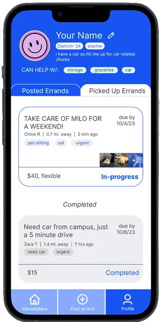
DESIGN DECISION #2
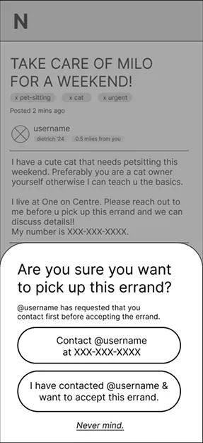
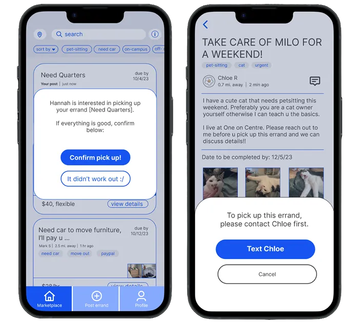
Make collaboration feel reliable by clarifying the logical flow of picking up an errand.
Our initial pickup flow relied heavily on users to respect an honor system, leaving both parties uncertain about an errand's status.
We introduced mutual pick-up confirmation and explicit status states (Available → Accepted → In Progress → Complete), giving both students visibility throughout the process. We also considered future payment integration.
High-Fidelity Wireframes
Using the revised set of hi-fi wireframes, we built our first interactive prototype.
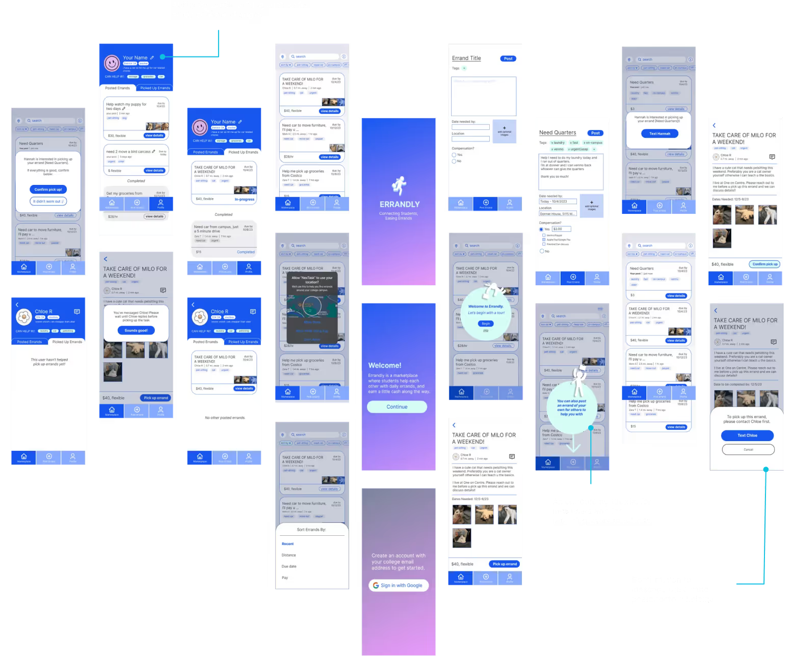
Usability Testing Round 2
We tested our interactive prototype with 4 potential users, using 12 different feedback points to adjust the first development version. Testing highlighted many opportunities to improve visual scanning, so I refined Errandly's visual identity. I focused on helping students quickly find relevant errands while keeping the marketplace visually lightweight.
DESIGN DECISION #3
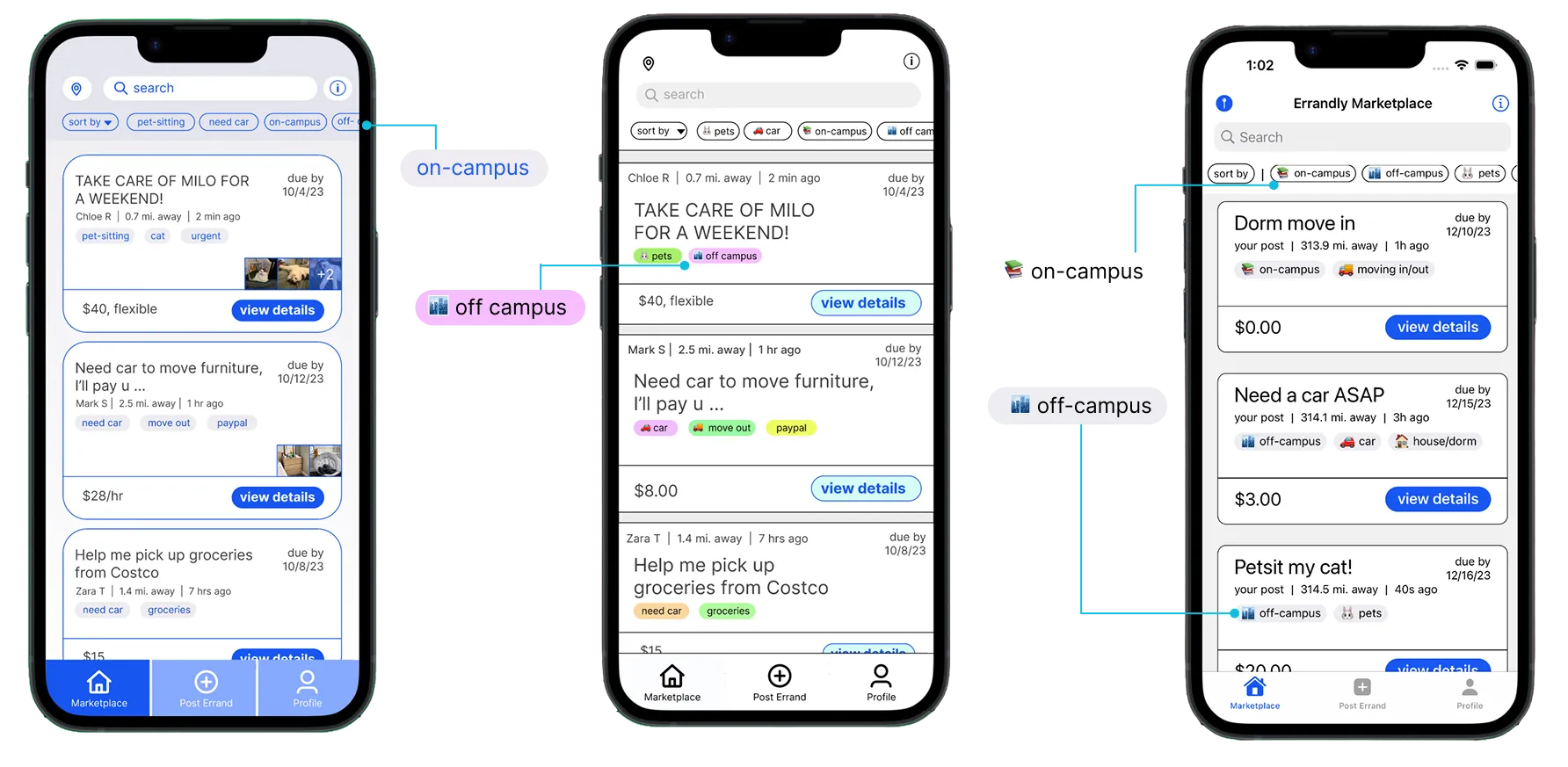
Making errands easy to scan and identify
One recurring challenge was how to distinguish different types of requests without overwhelming the feed.
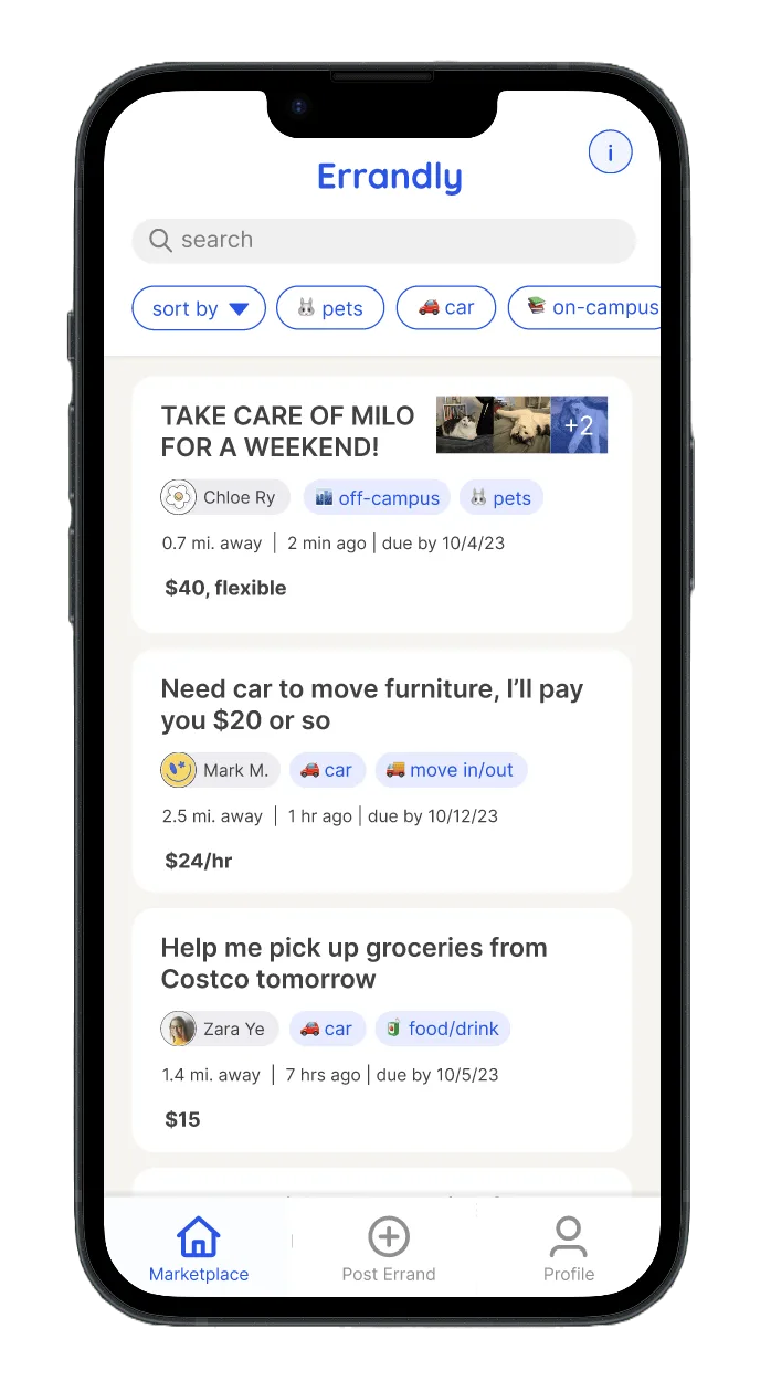
We explored several approaches to categorizing errands. Color-coding tags were quick to differentiate but visually noisy, while text categories were detailed but slow to scan. I decided on and implemented an emoji-based tagging system in the live application to balance glanceability with description.
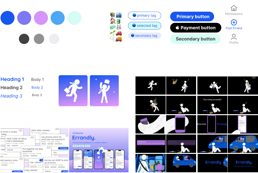
Design System
V. Development
After getting user feedback on our designs, we focused on preparing steps for the development, build, and deployment of the app.
With the user experience validated through iterative testing, we shifted our focus toward implementation. I collaborated on the SwiftUI front end while helping integrate Firebase services and native iOS APIs to transform the prototype into a functional marketplace application.
We made sure that our data and information architecture were logically sound to streamline our development of Errandly.
Building the Foundation
To support a two-sided marketplace, we structured the application around two primary collections: users and errands. This data model became the foundation for authentication, marketplace listings, user profiles, and real-time updates throughout the app.
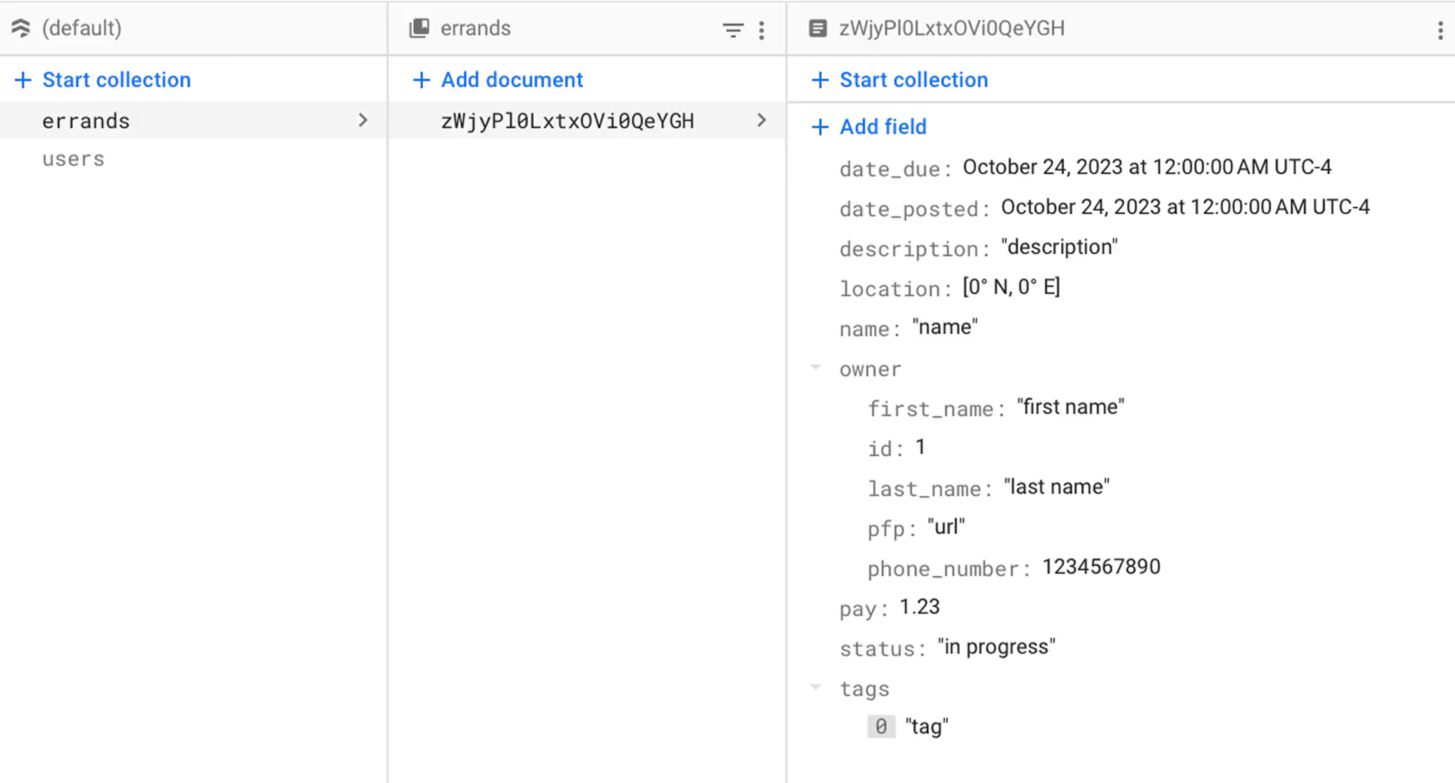
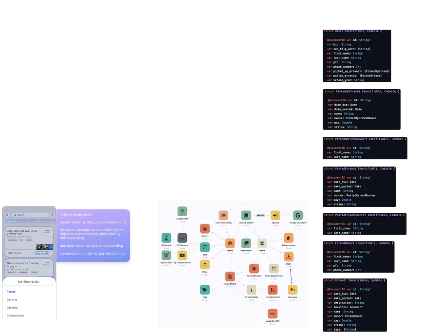
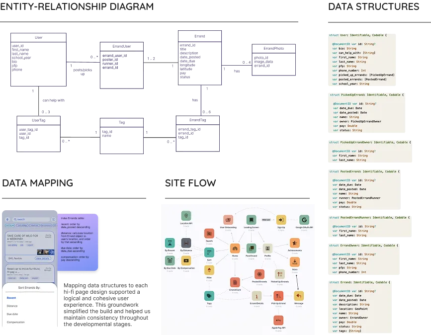
App Version 1: Create the essential experience
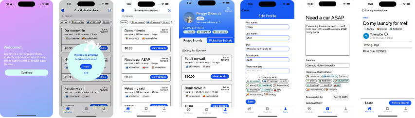
Our first development milestone focused on shipping the essential marketplace experience. I contributed to building core, must-haves flows: Google authentication, user profiles, errand posting and browsing, and full CRUD functionality so students could create, edit, complete, and remove errands.
Create
Post a new errand or register a user account into Firestore.
Read
Fetch the marketplace feed and errand details for a viewer.
Update
Edit a profile or mark an errand as claimed or completed.
Delete
Remove an errand a user posted or no longer needs.
Usability Testing Round 3
Between versions, we conducted testing with 6 users. Testing on physical devices uncovered 2 opportunities that I helped address on the second version:
- We needed to prioritize refactoring our code for less lag. There were performance issues when deployed on real devices. To enhance the user experience, we refactored code to ensure smooth interactions and faster response times within the app.
- We had to create immediate feedback for different user types as we lacked any feedback posting an errand or marking an errand as completed. I introduced clearer redirects, loading states, and permission handling so users always understood what happened after posting or completing an errand, such as sending a user back to the marketplace with an updated feed after posting an errand.
App Version 2: Leverage native iOS
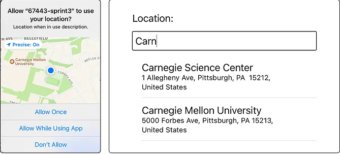
In the second version, we integrated key APIs: CoreLocation to fetch users' real-time location, iMessage for student communications, and Apple Pay for seamless errand payments.
Next Steps
What are users looking for if we had more time?
VI. Independent Evolution
After the project cycle ended, I continued working independently to implement new key features for the app to polish Errandly's user interface.
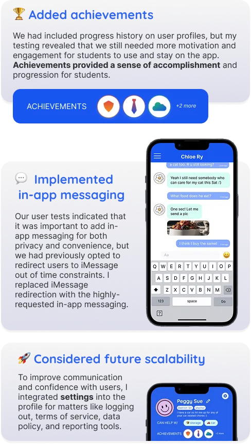
Although our semester concluded after the second development milestone, we identified several opportunities to further mature the product. For example, one highly requested feature we didn't have time to implement was enabling user communication to stay direct in the app, instead of redirecting to iMessage.
Motivated by these discussions, I continued improving Errandly independently. I conducted another round of design critiques with 5 designers.
Guided by their feedback, I redesigned core user flows and explored how the student experience could become more holistic, cohesive, and community-driven with a focus on usability.
PRODUCT IMPROVEMENT #1
Improve everyday interaction by upgrading the quality-of-life for users
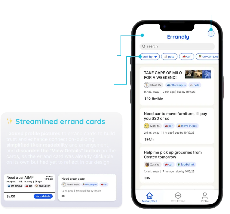
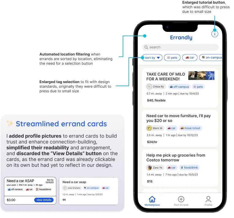
There were still accessibility issues with our design, especially once we tried out the app on various phone sizes. I focused on polishing the moments students would encounter most often.
Guided by design critiques, I enlarged interaction targets, streamlined errand cards, automated location filtering, and improved navigation to make the marketplace easier to browse and more accessible.
PRODUCT IMPROVEMENT #2
Build a stronger sense of community through trust signals
The original application successfully connected students, but interactions still felt transactional.
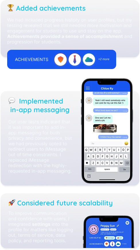
I designed ways to foster longer-term engagement by introducing achievement badges, native in-app messaging, and expanded account management with settings to support students' trust and scalability over time.
VII. Final Product Vision
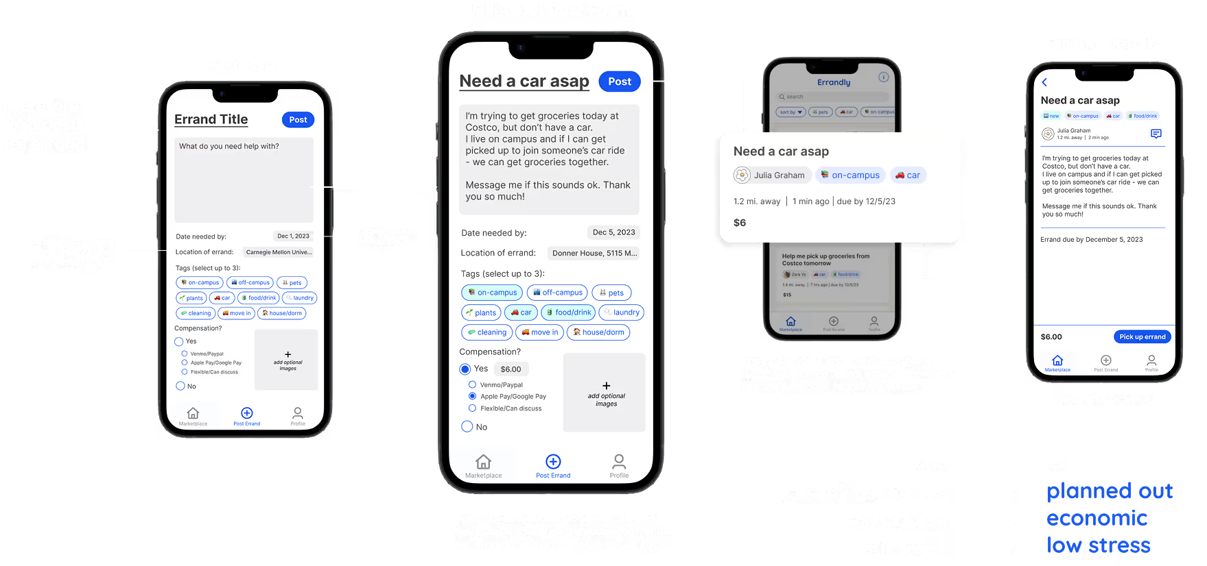
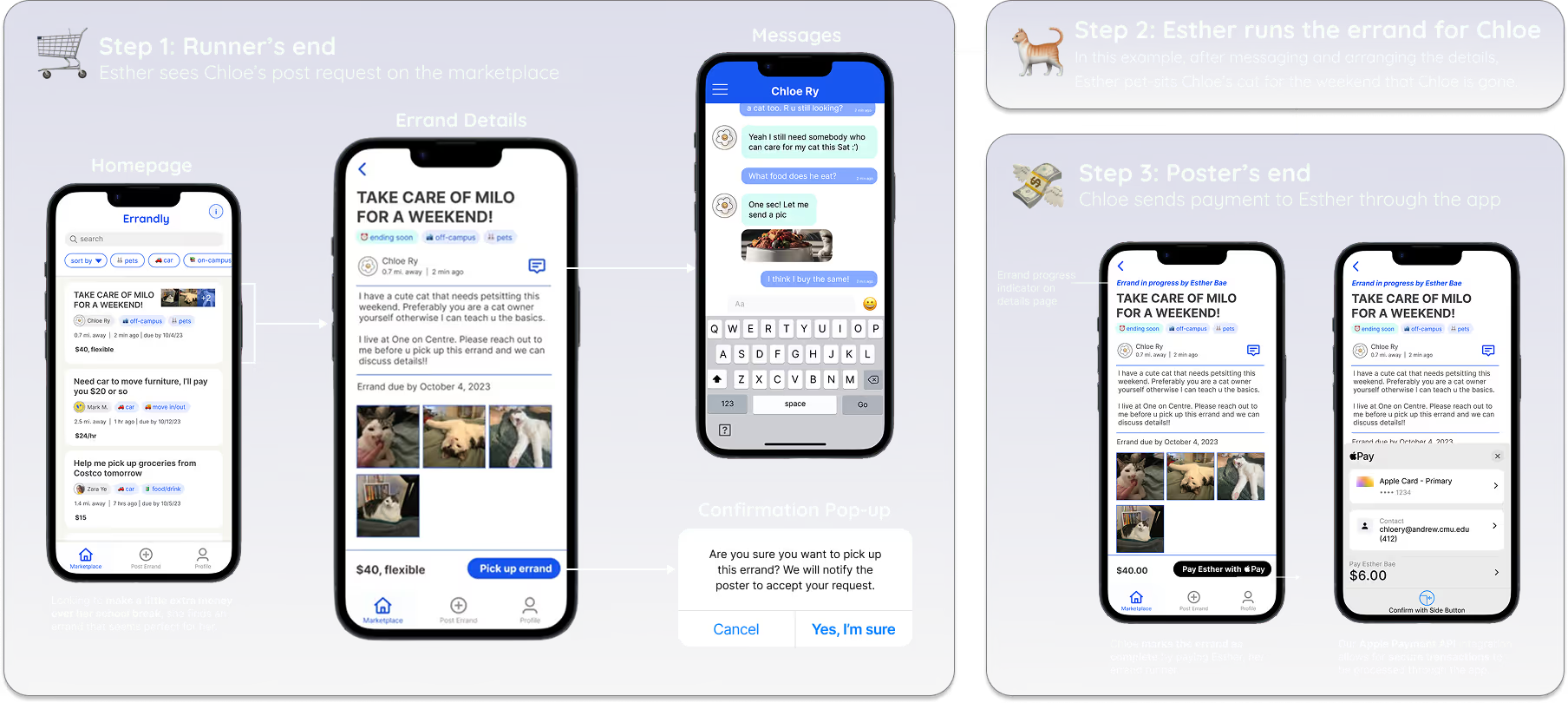
Posting and picking up an errand on the marketplace is a back-and-forth exchange between two student users.
These explorations culminated in two redesigned core experiences that bring together the usability, accessibility, and community improvements into a more cohesive product vision.
Example: Julia wants to get groceries, but has no car in her college city. She faces a variety of complications: the city bus system is unpredictable, Uber is expensive, and there are too many bags to carry.
Reflections
💻 Building products changed how I designed them
Working full-stack in Swift forced me to think about data and performance. As a result, I designed more state-aware flows that concretely considered feasibility and system behavior. Before this project, I was also unconfident in my programming, but I learned how to debug and ultimately deliver interfaces that we could submit Errandly to the App Store. I can appreciate firsthand the designer vs. developer memes and appreciate the work of both roles much better!
🤹️ Iteration is about reducing ambiguity
I noticed that across testing rounds, many improvements came from improving what existed (not in adding new features). I learned that good iteration is about reducing ambiguity, tightening mental models, and removing confusion.
⛳ Agile methodology as a framework
This was my first time developing within the mindset and scope of an iOS mobile app, so building Errandly 0 → 1 from idea to conception was very exciting. Working in agile sprints with clear timelines helped me so much in organizing my time.