
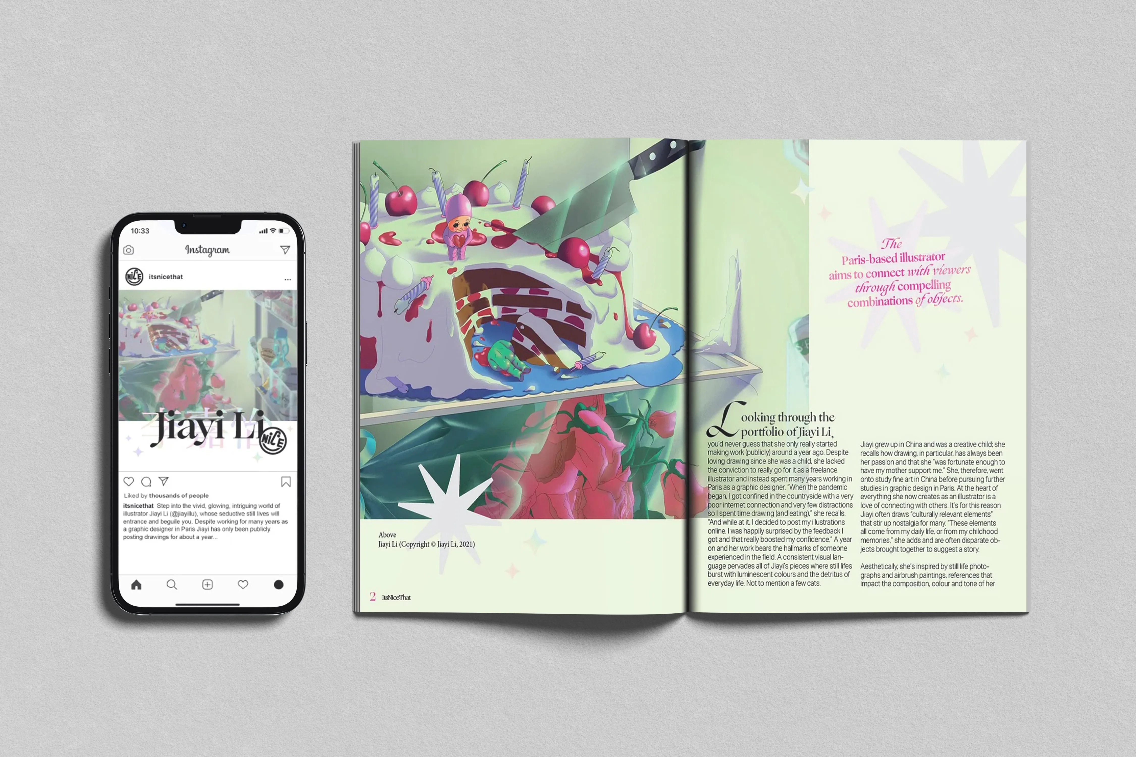
Jiayi Li's World is a design concept consisting of a magazine spread and Instagram advertisement for an ItsNiceThat feature article.
- Timeline
- 2 weeks, Oct 2022
- Areas
- Creative Direction, Advertising, Design Systems, Print Design, Typography
- Team
- For Jiayi Li, a Paris-based illustrator, and ItsNiceThat, a creative community platform. Advised by Kelsey Dusenka.
- Tools
- Adobe Suite (Photoshop, Illustrator, InDesign)
- TYPOGRAPHY
- AD
Project Overview
Jiayi Li is a Paris-based illustrator who grew up in China living in various big cities (Chongqing, Guangzhou, Huizhou, Shanghai). She studied fine art before pursuing further education in Paris for graphic design. Today, her illustrations are recognized for their culturally relevant elements that prompt sentimental memories.
My Contributions
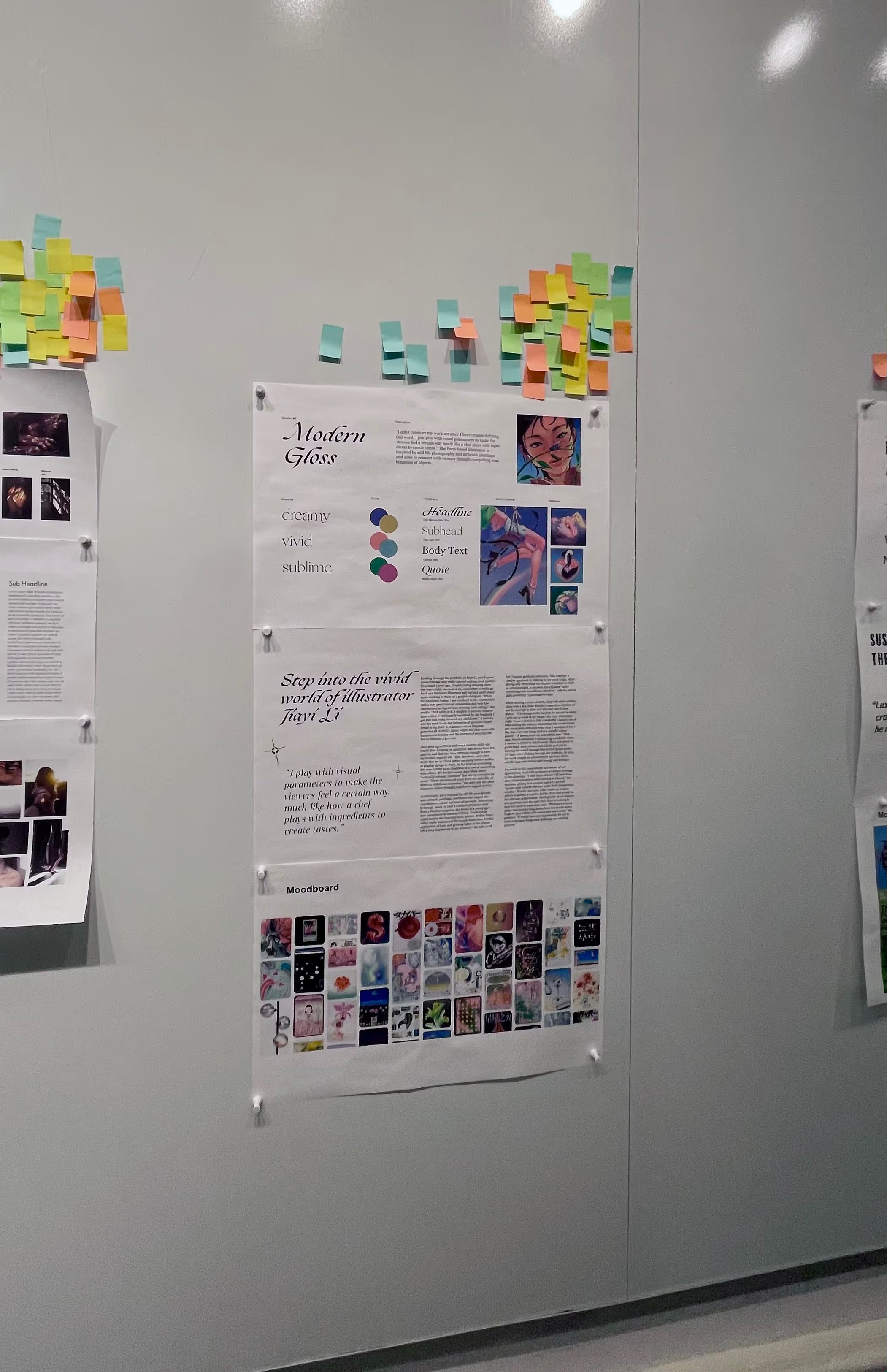
This case study goes through my process and reflection in creating a design system for her work, namely, designing a magazine spread and an Instagram advertisement around Jiayi Li's feature in an ItsNiceThat article.
Magazine Spread
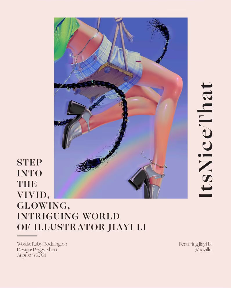
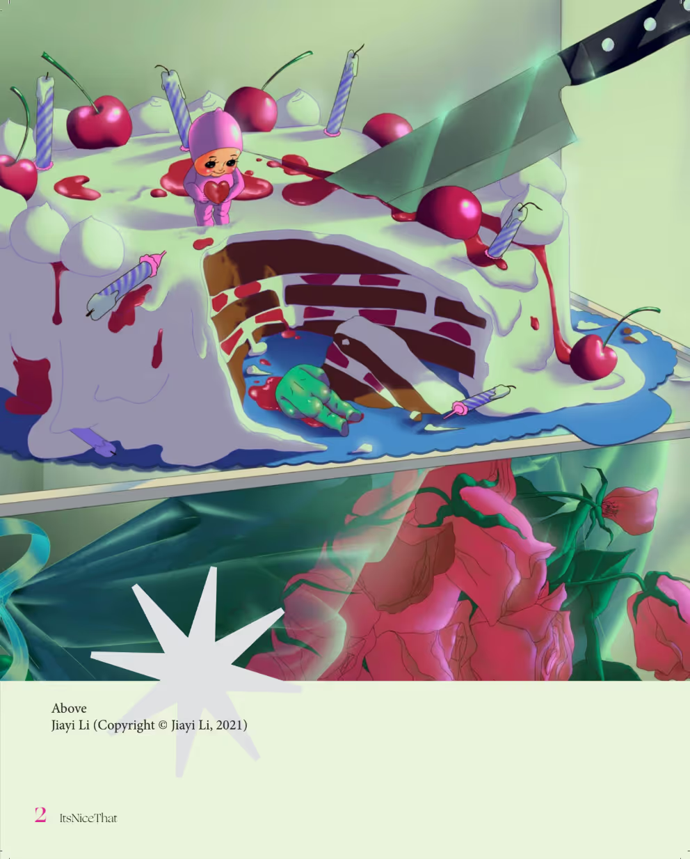
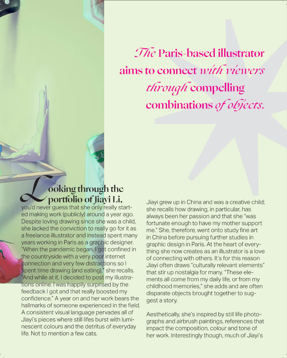
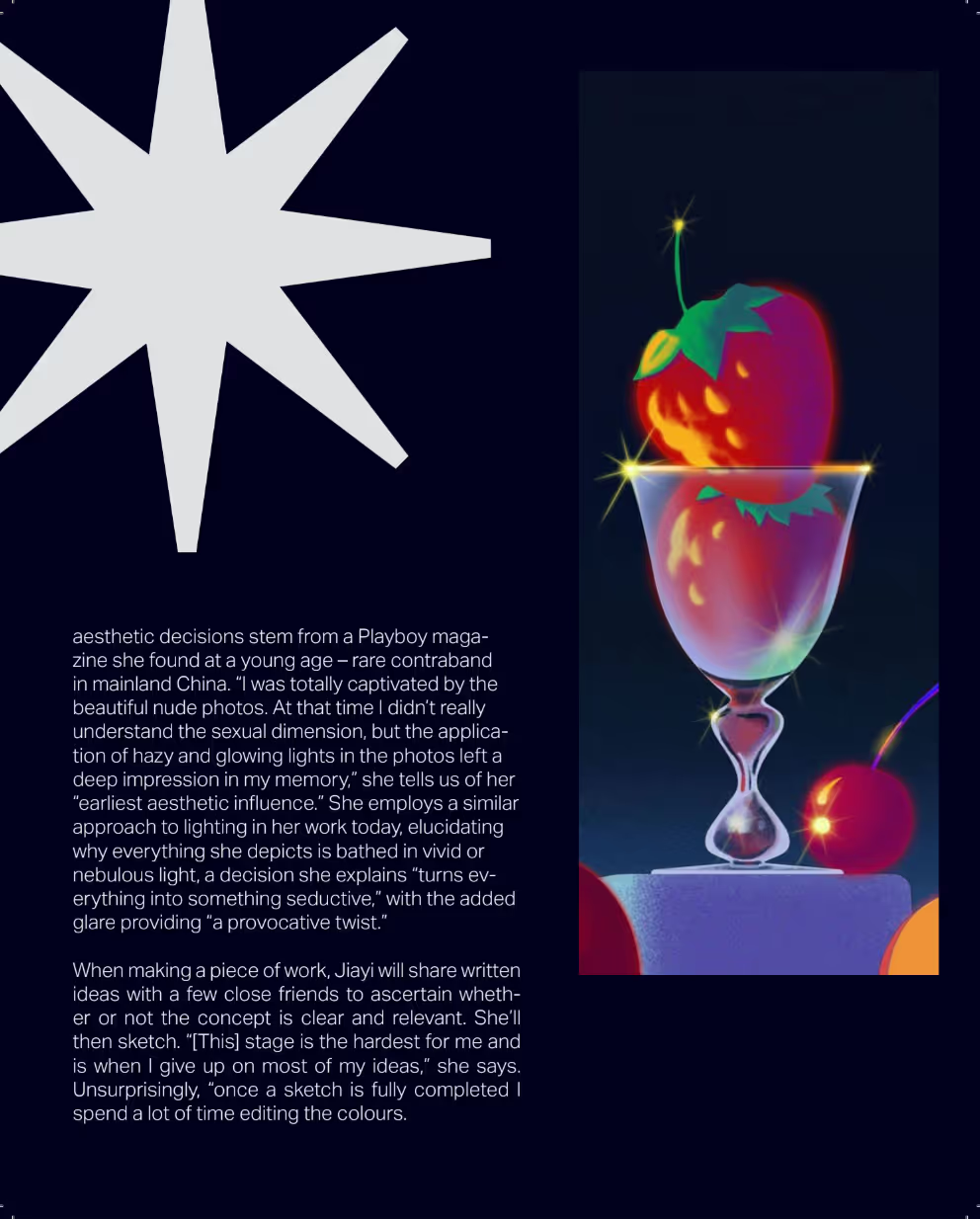
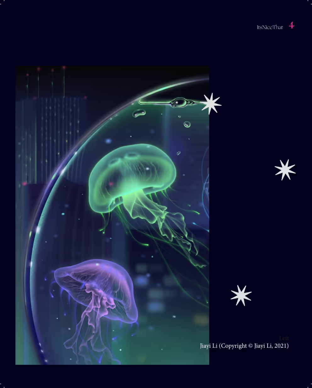
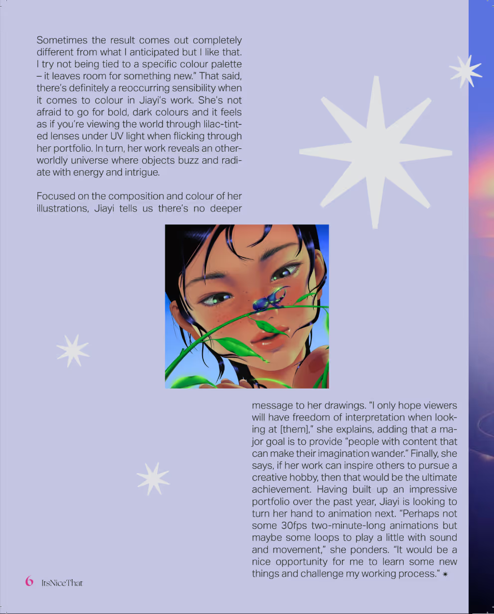

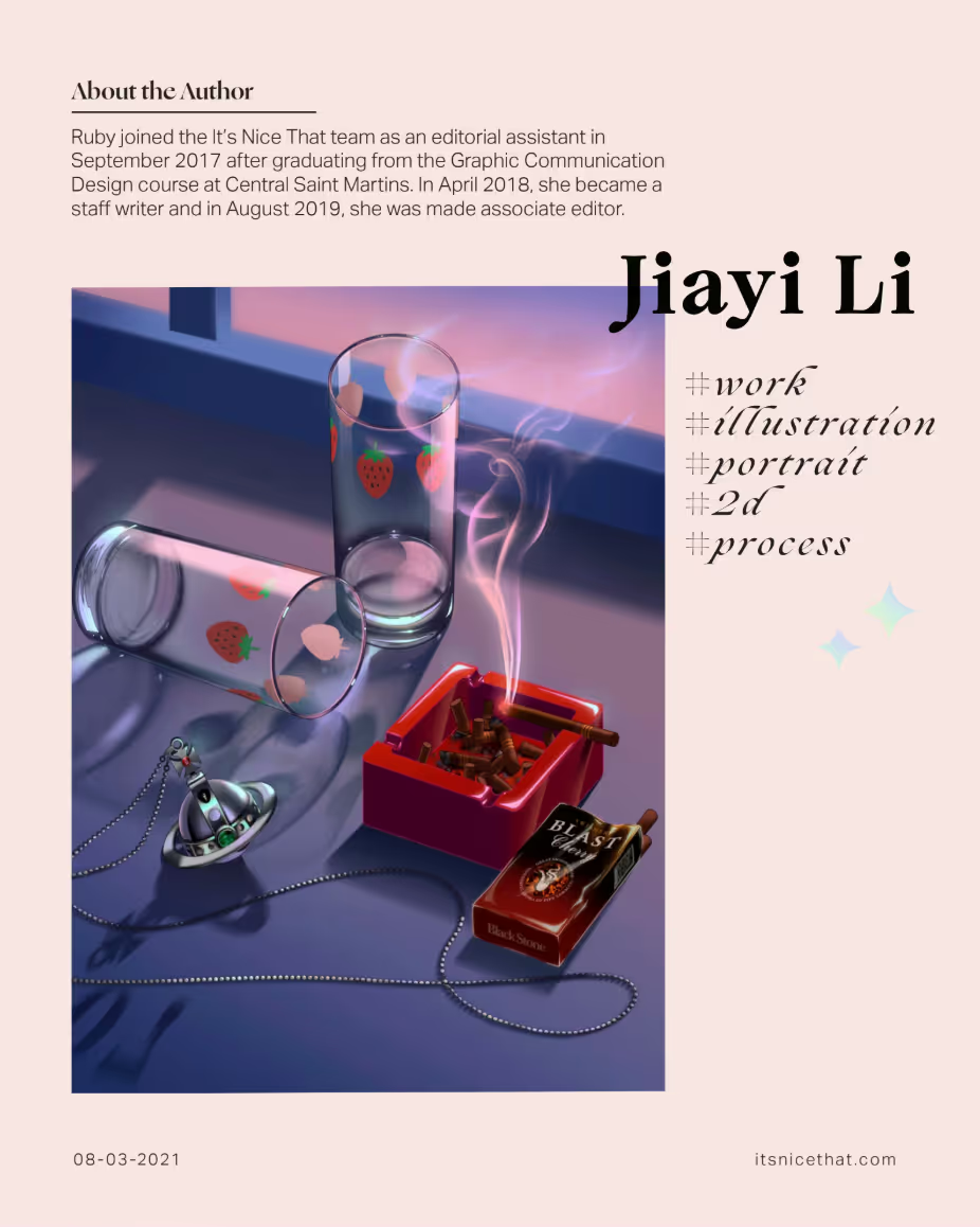
Tap either half, swipe, or use the arrows to flip through the booklet.
Reflections
✍ Learning more design software skills.
Concluding on this project, this design system was sincerely fun to work on from start to finish. I learned new software (Adobe InDesign) and really got to experiment with making a design project that was more complete and full in its execution rather than just doing smaller design exercises that make up many introductory design courses.
📑 Appreciation for communication media.
I came out of this project with a better appreciation for communication design in general – even though flipping through a magazine is a simple reading process, there is a lot of work that goes behind the design, and it's a testament to designers' focus and time spent thinking about UX and layout that a magazine spread can be such an effortless reading experience.
🗣️ Usefulness of critique sessions.
With the feedback given to me from final critique, I am really happy that others experienced the fluidity of the reading experience I created through my magazine spread. I loved the comment about how I designed a sort of "sleeper" of a cover, which opens up into a big, bold illustration page that creates an intriguing, enjoyable flip-through. It's satisfying that others found my design to be cohesive in both color and form, and appreciated little touches and additions I added throughout my designing process.